Heat Extremes
Data Limitations
Oklahoma generally has good quality long-term data records for temperature values, however, the consistency of cumulative years on record vary by station. The majority of stations consist of a large record dating back up to the 19th century, however, some station locations include gaps in records that could be subject to technical issues or changes in monitoring location.
Definition and Description
A heat wave is an occurrence of unusual hot weather (maximum, minimum, and daily average) over a region persisting at least two consecutive days during the hot period of the year based on local climatological conditions, with thermal conditions recorded above given thresholds (WMO 2016).
Note: There is no universally recognized metric for what constitutes a heat extreme. The World Meteorological Organization recommends characterizing a heat wave by its magnitude, duration, severity, and extent. Magnitude is defined as a thermal measurement such as maximum temperature, or combination of several measurements, exceeding certain threshold(s). These values must be determined by the local climatology. Other studies have used thresholds based on human physiological response to heat, such as consecutive days of maximum or minimum temperatures above a threshold.
Heat extremes in the central United States occur when a dominant large-scale high-pressure system prevents the movement of other air masses into a region. The high-pressure contributes to intense heating from solar radiation, due to a lack of cloud cover, and light winds preventing the dispersion of heat, especially from urban areas. This results in both higher than average maximum and minimum temperatures.
Historical Data
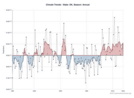
Historical Climate Trends Tool
(1895-present) Southern Climate Impacts Planning ProgramThis interactive graphing tool shows annual, seasonal, and monthly temperature trends by state and climate division. It can be used to gain a general understanding of temperature trends and show previous periods of higher temperatures, as well as years of extreme temperature. It could also be used to help estimate the probability of future extreme temperature events.
1. On left side of screen (from top to bottom) select Oklahoma → Climate Division of Interest → Season of Interest → Temperature. 2. For more information on how to interpret the chart, click on Chart Info.
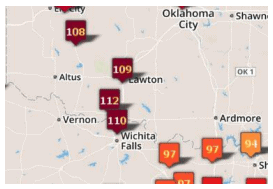
Climate Extremes Tool - Temperature
(Period of record varies by station; up to ~120 years) Southern Regional Climate CenterThis interactive tool shows temperature extremes at point locations. It can be used to show the severity of past events that have occurred in a region of interest. Highlighted below are two ways the tool can be used to analyze heat extremes:
(a) High temperature records by month: 1. On left side of screen (from top to bottom) select Records For A Month → High Max Temperature → Month of Interest → Go. 2. Mouse over icons for record details including station name, date of occurrence, and station period of record.
(b) All-time records: 1. Select All-Time Records → High Max Temperature→ Go. 2. Mouse over icons for record details including station name, date of occurrence, and station period of record. Note: For more information, select the Help or About tabs.
Temperature Trends Dashboard
(1970-2023) Southern Climate Impacts Planning ProgramThis tool shows temperature trends at individual stations across Oklahoma, including trends in extremely hot days, warm nights, seasonal extreme and average high/low temperatures, and cooling degree days, since 1970.
1. At the top of the tool, click the Extreme Heat, Warm Nights, Heating and Cooling Degree Days, Seasonal Averages, or Seasonal Extremes tab. 2. The default station is in Abilene, TX. To choose a station nearest to you, use the map on the right. Zoom in and click any of the blue dots to change stations. You can also select a station under the Station drop-down menu on the left of the page. 3. Use the graph to determine the trend (if any) for your selection. Solid lines represent significant trends. 4. Mouse over individual data points to view more information. 5. For seasonal selections, make sure you select a season in the Season drop-down menu on the left of the screen.

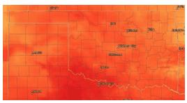
Heat Index Days and Hours
(1973-2023) Midwest Regional Climate CenterThis set of maps depict the average number of days, day with 3 or more hours, and average number of hours per year with heat index values at or above a variety of thresholds (e.g., 95°F, 110°F, 105°F).
1. Near the top of the page, click on the map link of interest out of the three options: Average Number of Days, Days with 3 or More Hours, or Average Number of Hours. 2. Right above the map, mouse over the heat index value of interest to view the corresponding data on the map. 3. To interpret the colors, see the legend on the top right side of the map. 4. To view more detailed information, such as station data, click the Interactive GIS Maps button on the top right of the page.
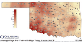
Average Number of Days with Highs Above 90°F or 100°F; Cooling Degree Days
(1991-2020) Oklahoma Climatological SurveyThese static maps show the average number of days per year when the high temperature is above 90°F or 100°F. There is also a map of the average annual cooling degree days between 1991-2020.
1. Scroll to the second row of maps on the page. 2. Click on Average number of days with highs above 90˚F (or 100°F), or Normal Annual Cooling Degree Days (CDD).
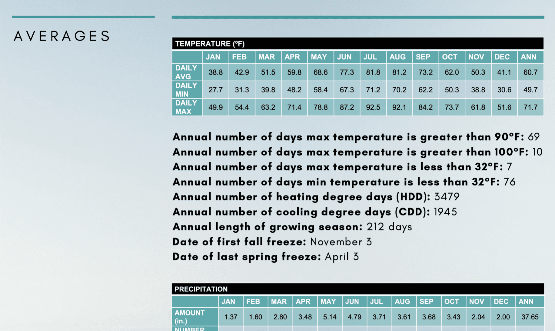
County Climate Summaries
(Period of record varies by county; up to ~120 years)Oklahoma Climatological SurveyThis site provides climate summaries for each county in Oklahoma. Browse the county-level documents for average and extreme climate statistics for multiple climate hazards, including extreme heat.
1. Click on a county of interest from the list. 2. In the Averages section, view the temperature table for the daily maximum temperature average by month or view additional statistics below. Statistics relevant to extreme heat include: average annual number of days maximum temperature is greater than 90°F or 100°F and annual number of cooling degree days. 3. In the Records & Extremes section, view the record high temperature and the date in which it occurred. Note: Unless noted, average/normal values are based on the 1991-2020 period.
Climate Change Trends
The frequency and intensity of heatwaves and extreme heat events have increased across the United States since the mid-1960’s (Wuebbles et al. 2017b). Warming in Oklahoma has occurred mostly during the winter and spring seasons (Frankson et al. 2022). As the global temperature continues to increase, the occurrence and intensity of extreme heat events are projected to increase as well (Wuebbles et al. 2017b). As seen from the Climate Explorer tool, the average temperature across Oklahoma is projected to increase by up to 7°F and the number of days over 100°F could increase by ~15-45 days per year by mid-century, depending on the emissions scenario. Read more about future heat extremes in Climate Change Science and Projection Resources.
Climate Explorer – Climate Maps and Graphs Tools
(1950-2099)NOAA Climate Program Office and National Environmental Modeling and Analysis CenterThe Climate Explorer is an interactive tool that allows you to view and compare the average number of warm nights, extremely hot days, and cooling degree days per year for the historical period and in the future under both higher and lower emissions scenarios.
1. Type in the city or county you are interested in. 2. Click Climate Maps. 3. From the drop-down menu, select Days w/ max temp > 90 (or other option up to 105°F), Days w/ min temp > 80°F (or 90°F), or Cooling Degree Days 4. Next to the drop-down menu, select Map. 5. Use the middle slider on the map to compare averages between historical, lower, and higher emissions scenarios. (Use the bottom drop-down menus to choose variables and the slider on the bottom right to choose a decade to compare with.) On the map, zoom in to the county level and click a county to view the associated values. 6. To view this information over time (1950-2099) for a single location, click the Graph tab at the top of the map and type a location at the top.
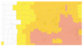
Killer Heat Tool
(1971-2099) Union of Concerned ScientistsThis interactive mapping tool shows the number of days with maximum heat index above 90°F, 100°F, 105°F, and ‘off the charts’ (exceeding the upper limits of the NWS heat index scale) for each U.S. county over the historical baseline (1971-2000), mid-century (2036-2065), and late century (2070-2099). Future projections include scenarios for no action, slow action, and rapid action on climate change.
1. At the top of the tool, click the Above 90, Above 100, Above 105, or Off the Charts tab. 2. Zoom in to the desired area on the map. The default map displays historical number of days above the threshold. 3. Click the county of interest to view the historical number of days per year above the selected heat index threshold. 4. On the left panel, scroll through the text and select a future scenario with no action on climate change, with slow action on climate change, or with rapid action on climate change for the Midcentury or Late Century time frame. 5. Click the county of interest to view the number of days per year above the selected heat index threshold for the scenario and time frame selected. 6. This information is also available for military bases in the U.S., accessible through the Military Bases at Risk tab at the top of the page.
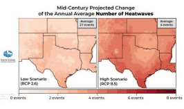
Temperature Projections - Heatwaves
(2036-2099) South Central Climate Adaptation Science CenterThis webpage includes several temperature projections, including the projected number of heatwaves per year, for the south-central U.S. during the mid-century (2036-2065) and end-ofcentury (2070-2099) time frames under low and high emissions scenarios.
1. The projections are grouped by mid-century and end-of-century. Scroll down to Projected Change of the Annual Average Number of Heatwaves for the time frame you’re interested in. 2. The maps in the middle of the page show the projections under a low emissions scenario on the left and high emissions scenario on the right. The average value in the top right of each map represents the average for the entire region, so use the legend below the map to estimate the value for your area. Note: Click the map to view a larger version. 3. On either side of the page is a text summary of the projections for both emissions scenarios. Note: You can use these maps to view the range of projected values, as the future value will likely fall somewhere in between the low and high emissions scenarios.