Drought
Data Limitations
Drought cannot be assessed by a single indicator. Unlike many other hazards where impacts are immediate and apparent, drought has a slow onset, sometimes goes undetected, and affects different sectors on different timescales. Consequently, it is important to assess drought using a variety of indicators, some which respond better to short-term conditions, such as for agriculture, and others that respond to longer-term conditions, such as water resources. Many indicators are combined into the weekly U.S. Drought Monitor, however, this only dates back to 2000.
Definition and Description
A deficiency of moisture that results in adverse impacts on people, animals, or vegetation over a sizeable area (NWS 2009).
Drought impacts vary based on the duration and intensity of the event. A few dry weeks may affect crops and lawns, while droughts lasting months or years may significantly impact large water resources. At its extreme, nearly decade-long droughts may lead to farm and business foreclosures and mass migration. Some conditions that may lead to drought development include a large-scale, stationary high-pressure system which inhibits precipitation, feedback from dry soils accelerating warming of the air, La Niña which displaces jet streams, or large-scale ocean circulations in the Pacific and Atlantic Oceans. Droughts may happen in any location and at any time of year. Impacts often become severe more quickly for drought occurring during the summer, when evaporative loss is high; however, slower-evolving droughts in the fall and winter can have tremendous economic impacts on winter crops and livestock. Droughts are more frequent in areas where annual evaporation may exceed annual precipitation.
Drought is rated by the weekly U.S. Drought Monitor (2018) on a scale from D0 (abnormally dry) to D4 (exceptional drought). D0 occurs, on average, in any given location about 21-30% of the time. D1, moderate drought, occurs on average 11-20% of the time, or roughly once every 5-10 years. D2, severe drought, occurs 6-10% of the time, or about every 10-20 years. D3, extreme drought, occurs 3-5% of the time and D4, exceptional drought, occurs 0-2% of the time, or about every 50 years. Severity is based upon a variety of drought indicators, impacts, and input from local experts.
Historical Data
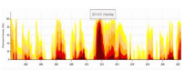
U.S. Drought Risk Atlas
(Period of record varies by station; up to ~80 years) National Drought Mitigation CenterThis interactive tool provides historical drought indices at a local level and can identify drought periods at different levels of severity, duration, and frequency.
1. On the left side, select Texas to search by state or zoom in on the map, then search by location. 2. Scroll down to select a station from the Station List on the right or choose a station from the map. Then, click Update Selection. 3. Below, there are a variety of drought indicator tabs to explore. Choose which indicator you would like to view. 3a. The Precip & Temp tab provides weekly, monthly, or annual averages of total precipitation and minimum and maximum temperature, shown in graphs. Select a date range or select a decade or the period of record from the drop-down menu. Select weekly, monthly, or annual information from the Aggregate drop-down menu. 3b. The Drought Monitor tab shows values from the U.S. Drought Monitor, which began in 2000. Select a date range and a Boundary (state, county, etc.). There are three ways to view the information. Select Time Series to view a graph of U.S. Drought Monitor values over time, averaged over the boundary you selected, Table to view a table of weekly drought monitor values, or Heat Map to view weekly values by year (use the slider to scroll through the weeks). 3c. The Trends tab shows various trends in several drought indicators and how statistically significant those trends are. Under the Index drop-down menu, select precipitation or a drought indicator. For any indicator, select a Start Year and Significance level. Some indicators require you to also select a Season, and the Precipitation indicator requires a Precipitation Threshold in inches. After you make the selections, click Trends Chart on the right. A graph will display with the trend in the selected indicator over time. A blue dashed trendline represents an increasing trend in that indicator, a red dashed trendline represents a decreasing trend, and a black dashed trendline represents no trend. The trend value per decade is shown in text underneath the graph. Note: There are many other tabs with additional data and information. We only include a few prominent features here due to the complexity of other indices and length of instructions.
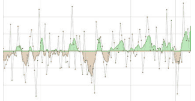
Historical Climate Trends Tool
(1895-present) Southern Climate Impacts Planning ProgramThis interactive graphing tool shows precipitation trends, of which very dry periods are a drought indicator.
1. In the left column, moving from top to bottom, select Texas→ Climate Division of Interest → Season of Interest → Precipitation. 2. Hovering the curser over a point will display the year and total rainfall for the selected season. 3. For more information on how to interpret the chart, click on Chart Info.
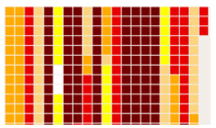
U.S. Drought Monitor Time Series
(2000-present) Texas Water Development Board and Office of the Texas State ClimatologistThis tool shows the frequency of drought conditions since 2000, along with each drought’s maximum intensity and duration (shown by color scale).
1. This page first shows a large map of current U.S. Drought Monitor categories across Texas. Select a county you’re interested in from the map or leave the map as the default for statewide information. 2. A graph will be displayed under the map, showing the weekly U.S. Drought Monitor categories from 2000 to present day for your selected county or the state. On the graph, hover over the time period of interest to get information on percentages of area in the different levels of drought across the county/state.
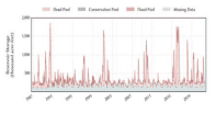
Reservoir Storage Tool
(Period of record varies by station; up to ~80 years) Texas Water Development BoardThis interactive tool provides recent and historical reservoir storage data across Texas. You can view graphs of recent and historical reservoir storage for the dead pool, conservation pool, and flood pool, as well as statistics of monthly averages for percent full for the most recent 30 years.
1. Select a reservoir by clicking on the map then clicking the link in the pop-up box OR select a regional area from one of the drop-down menus above (By Planning Area, By River Basin, etc.). 2. Recent data is shown on the graph by default. Select the Historical tab below the graph to view the data for the period of record. 3. To view monthly percent full statistics, click the Statistics tab. 4. The tables below the graph show statistics up to one year in the past, and additional reservoir information is located further down the page.
Climate Change Trends
Drought has always been part of Texas’ climate because of highly variable precipitation patterns. Because Texas is large and diverse, it is hard to make a statewide summary or projection of drought (Nielsen-Gammon et al. 2020). However, droughts will likely increase in severity and frequency. Even in areas where there is little change in annual precipitation expected, higher temperatures will increase evaporation from soils in all areas of the state, intensifying naturally occurring droughts (Runkle et al. 2022; Wehner et al. 2017). An increase in drought conditions would strain natural resources, resulting in economic and societal consequences as it will affect agriculture and drive up costs of commodities and utilities (Kloesel et al. 2018). Read more about future drought in Climate Change Science and Projection Resources.
Western TX: In western Texas, annual rainfall has changed little over time since 1895 (Nielsen-Gammon et al. 2021). Models project a decrease in rainfall by the end of the century, especially in winter and spring in far western Texas (Hayhoe et al. 2018). With the addition of increased evapotranspiration and decreased soil moisture from higher temperatures, drought conditions are expected to increase (Runkle et al. 2022; Wehner et al. 2017).
Central TX: In central Texas, the most prominent decrease in rainfall is projected in the winter and spring by the end of the century. However, the changes in rainfall are small and not significant except in south central Texas (Easterling et al. 2017). Even with small changes in precipitation, increased temperatures will increase evapotranspiration from soils and increase risk of drought. Furthermore, it is estimated that there will be more time in between rain events for dry conditions to occur.
Eastern TX: Precipitation has increased since 1895 in eastern Texas, and little overall precipitation changes are expected by the end of the century (Nielsen-Gammon et al. 2021; Hayhoe et al. 2018). However, soil moisture is projected to be much drier by the end of the century from increased evapotranspiration from rising temperatures (Runkle et al. 2022). More time between rain events is also expected, which can lead to periods of dry conditions.
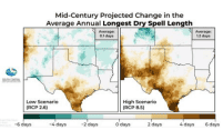
Precipitation Projections
(2036-2099) South Central Climate Adaptation Science CenterThis webpage includes several precipitation projections, including the projected average annual number of days with rain and longest dry spell length, for the south-central U.S. during the mid-century (2036-2065) and end-of-century (2070-2099) time frames under low and high emissions scenarios.
1. The projections are grouped by mid-century and end-of-century. Scroll down to Projected Change in the Average Annual Number of Days with Rain or Projected Change in the Average Annual Longest Dry Spell Length for the time frame you’re interested in. These two variables relate to drought from a precipitation perspective. 2. The maps in the middle of the page show the projections under a low emissions scenario on the left and high emissions scenario on the right. The average value in the top right of each map represents the average for the entire region, so use the legend below the map to estimate the value for your area. Note: Click the map to view a larger version. 3. On either side of the page is a text summary of the projections for both emissions scenarios. Note: You can use these maps to view the range of projected values, as the future value will likely fall somewhere in between the low and high emissions scenarios.