Poor Air Quality (Dust, Pollutants, Smoke)
Data Limitations
Geographical and spatial gaps exist for air quality data, especially in rural areas. However, areas distant from monitoring stations typically experience consistently good air quality. Also, there is no single air pollutant relevant to every discussion, so there is no single way to express air quality (Tracking California 2021). Monitoring frequency varies by pollutant (e.g., carbon monoxide, nitrogen dioxide, sulfur dioxide, and lead). Tools often display data for the five air pollutants that make up the Air Quality Index (AQI): carbon monoxide, nitrogen dioxide, ozone, particulate matter (PM10 and PM2.5), and sulfur dioxide.
Definition and Description
A measure of the monitored natural and man-made pollutants in an area.
Air quality problems result from the accumulation of aerosols, such as dust, pollen, smoke, salt, or human-produced chemically-active compounds that build up in an area over time. Under normal conditions, winds disperse these aerosols and compounds, but sustained periods of light winds can allow buildup to unhealthy levels. Many aerosols are produced naturally but may have artificially elevated concentrations through burning (concentration of smoke and carbon monoxide) or agriculture. Industrial activities and urban environments add other sources of pollution, including photochemical smog, which is produced from the interaction of sunlight with nitrous oxides (primarily from automobile engines) and volatile organic compounds. Ozone is a component of this smog.
Air quality problems occur when dispersion – the ability of the atmosphere to spread pollutants over a large area – is inhibited. Temperature inversions, where a warm layer of air aloft prevents upward motion, and light winds, such as a large high-pressure system, provide favorable conditions for air quality events. Some pollutants, such as ozone, occur in higher concentrations during higher temperatures and more intense sunlight while others, such as smoke or dust, can accumulate in high concentrations any time of the year. Local and regional landscapes, such as mountain valleys, can also “trap” pollutants. Warmer summertime temperatures are likely to increase the concentration of pollutants such as ozone.
Concentrations of pollutants are measured and averaged over time. A time-averaged concentration is used because exposure to a high concentration of pollutants during a short time might have an impact equivalent to an exposure to a lower concentration over a longer time (American Meteorological Society). When the average exceeds public health regulations over a defined period, such as several hours or a day or a number of days per year, the area is noted as being noncompliant. One way to assess air quality for your location is to look at the daily Air Quality Index (AQI) issued by the U.S Environmental Protection Agency. AQI is calculated for five major pollutants including ground-level ozone, particle pollution (particulate matter), carbon monoxide, sulfur dioxide, and nitrogen dioxide.
Historical Data
Nonattainment Areas for the Criteria Pollutants
U.S. Environmental Protection AgencyThis interactive mapping tool displays areas that are not currently within EPA regulations of the criteria pollutants.
1. Select the criteria of interest from the lists on the page. 2. On the criteria pollutant page, scroll down to section 4C (under Area Maps) and click the Interactive Map link. 3. Dark blue shaded areas on the map are nonattainment areas. 4. To view information for specific monitoring sites, zoom and pan to the area of interest and click the point. Access the legend on the top right of the screen.
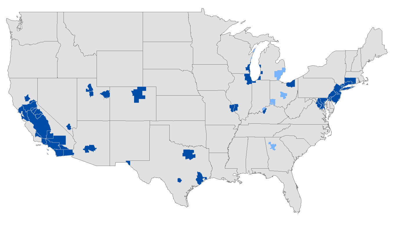
Air Compare
(2012-2021) U.S. Environmental Protection AgencyThis interactive map displays county-based trends for the five AQI air pollutants that may affect human health. For data limitations specific to this tool, including the pollutants that are accounted for in the analyses, click on the Basic Info tab at the top of the page, then Data Limitations on the right side of the page. Note: For information on the predominant directions in which air pollutants flow, refer to the Wind Rose Plots tool in the Wildfire section.
1. Scroll down until you see the map. 2. In the upper lefthand corner of the map, click on Trends, then select category of interest. 3. Zoom in and click county of interest to obtain a graph of annual statistics. Counties shaded darker blue have data available. You can click multiple counties to compare locations. Each graph appears above the map. 4. For data broken down into months, click on Seasons in the upper lefthand corner, then select the group of interest.
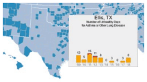
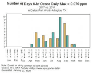
Ozone Exceedances
(1980-present) U.S. Environmental Protection AgencyThis interactive graphing tool compares 8-hour ozone exceedances between two years or multi-year periods for a city or county. Comparisons are shown by day, month, and year. The ozone exceedance level for this tool is 0.070ppm.
1. Under Geographic Area, select a city/county of interest 2. Under Baseline Period, select either a single year or a multi-year period and the year(s) in which you are interested. 3. Under Comparison Period, select either a single year or a multi-year period and the year(s) in which you are interested in. 4. You may need to uncheck Use ALL Monitors when comparing time periods if data aren’t available for both periods. 5. Click Plot Data.
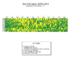
Outdoor Air Quality Data
(Period varies by pollutant; up to 1980- present) U.S. Environmental Protection AgencyThis multi-year tile plotting tool shows the daily AQI pollutant values for a specific location or time period. Each tile represents one day of the year and is color-coded based on the AQI level for that day.
1. Under Pollutant, select pollutant of choice (e.g., Ozone, All AQI Pollutants). 2. Under Period, select a beginning and ending year (maximum of 25 years). 3. Under Geographical Area, select a city or county. Note: cities available are listed in the Ozone Exceedences tool above. 4. Click Plot Data. The legend is located below the plot.
Climate Change Trends
While many metropolitan areas in Texas exceed national standards for air quality, from 2000-2020 there were great improvements due to increased research and mitigation efforts, even with population increases (TCEQ 2021). If these efforts continue, so will air quality improvements (Allen et al. 2018). If not, air quality conditions may worsen in the future. Increasing temperatures are tied to increasing ozone levels closer to pollution sources, which cause health issues such as asthma and respiratory problems. A longer wildfire season may also lead to an increased amount of ozone and particulate matter, and a lengthened pollen season may increase the allergens in the air (Nolte et al. 2018).